Bread Poets
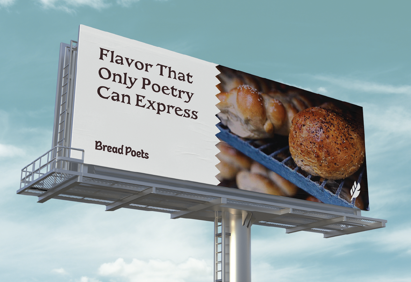
Flavor That Only Poetry Can Express
3
Posted 10/16/24 (Wed)
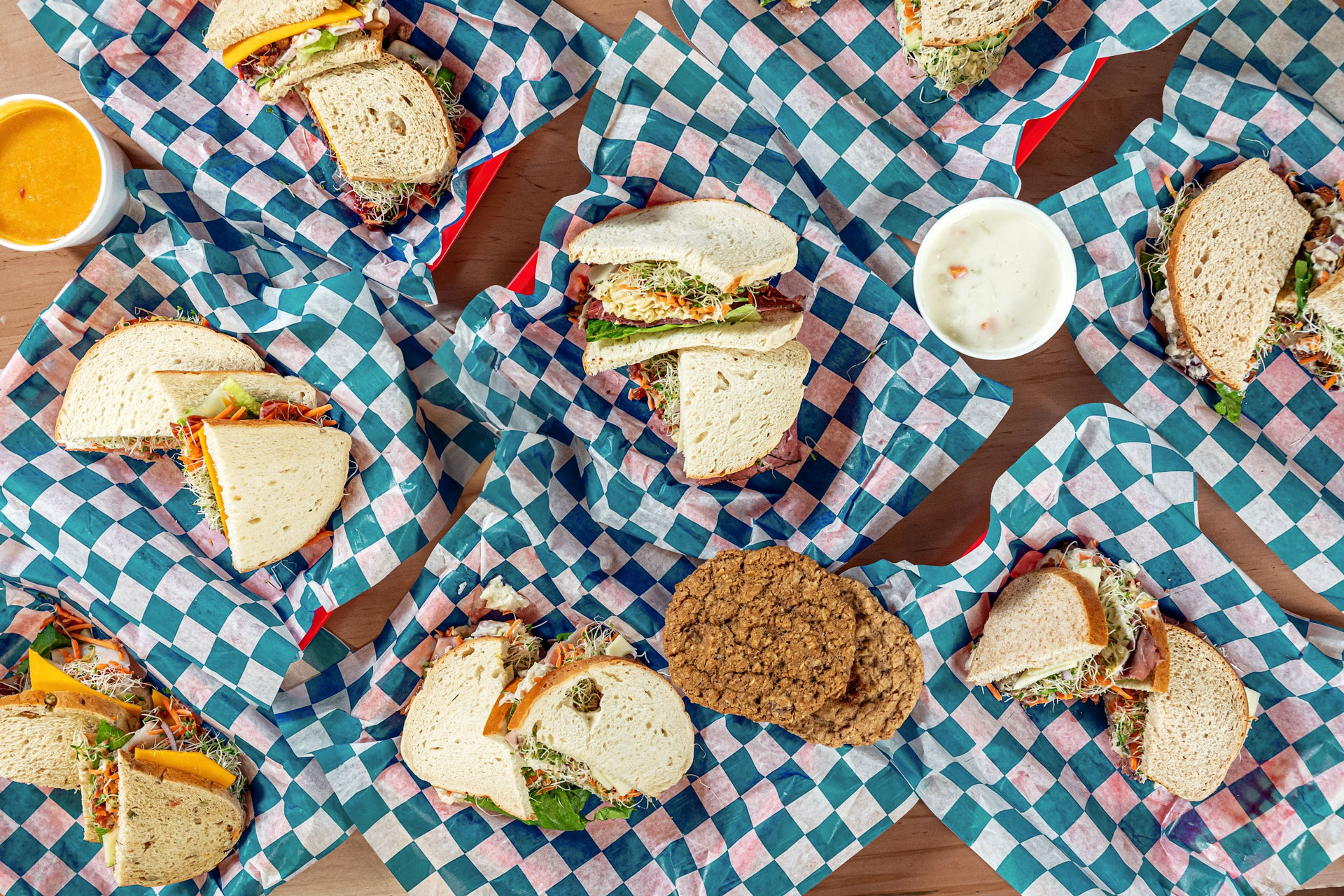
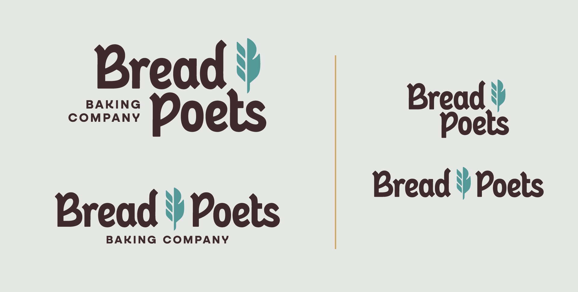
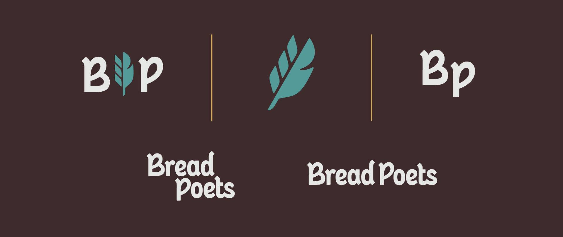
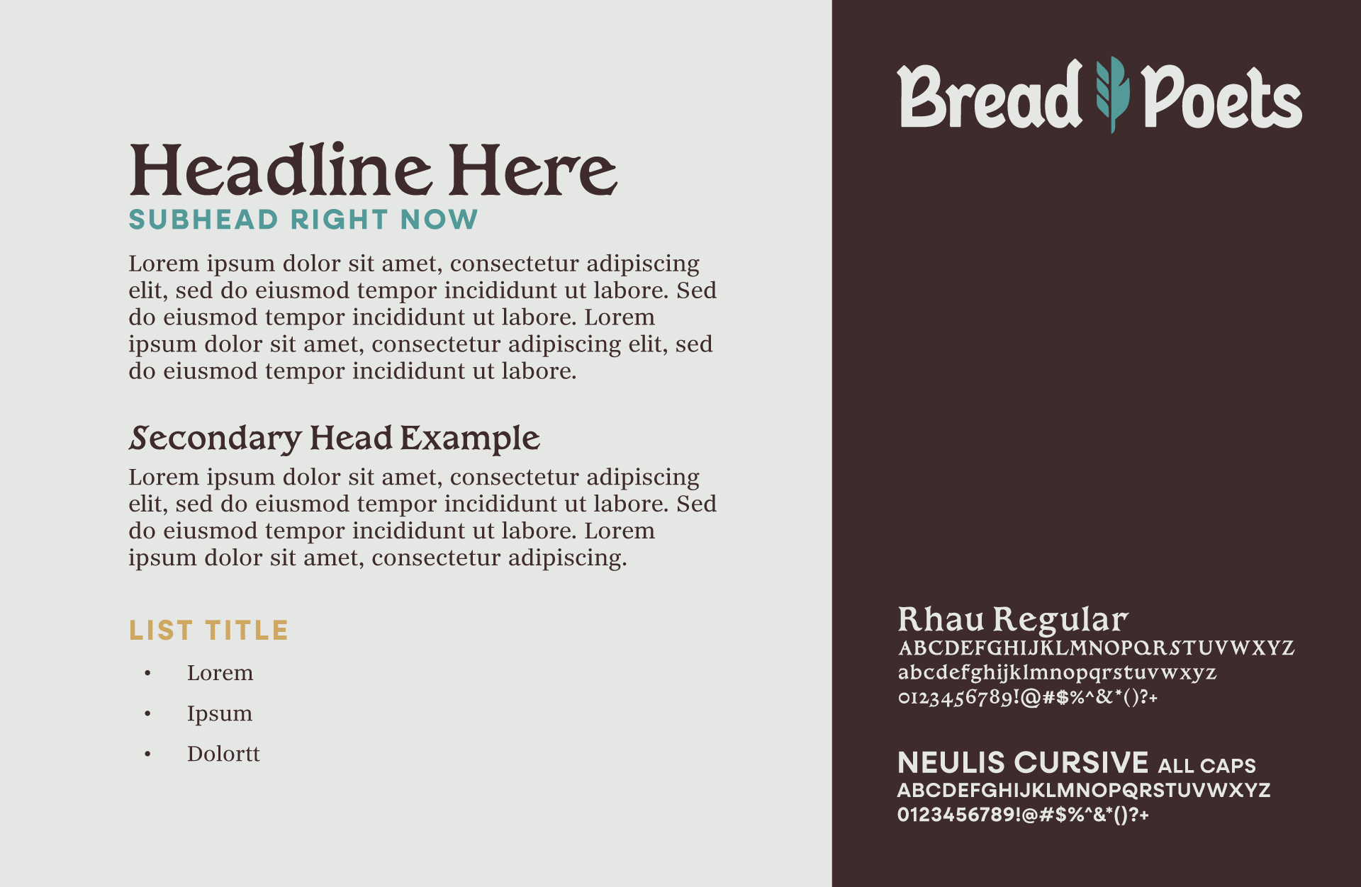
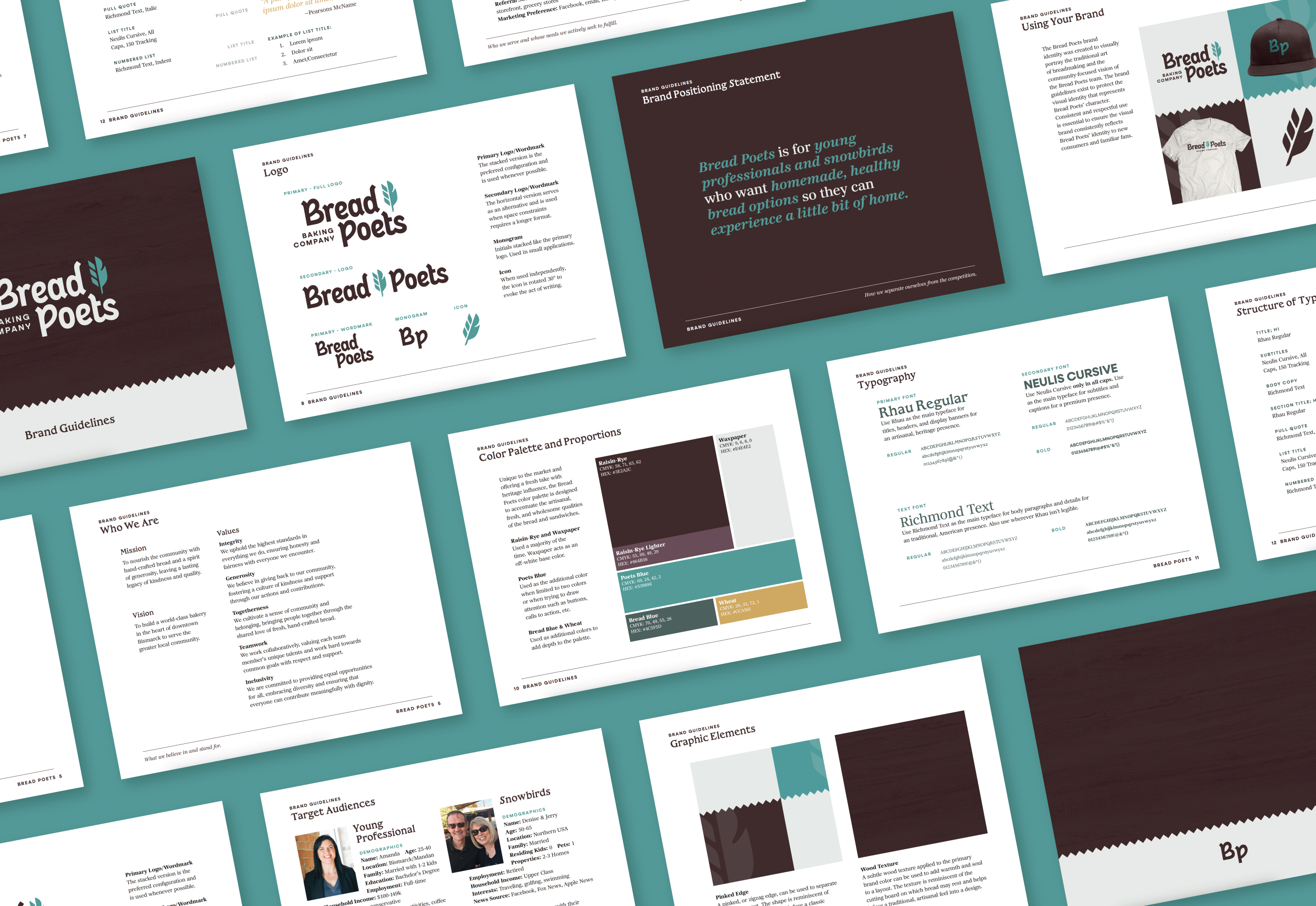
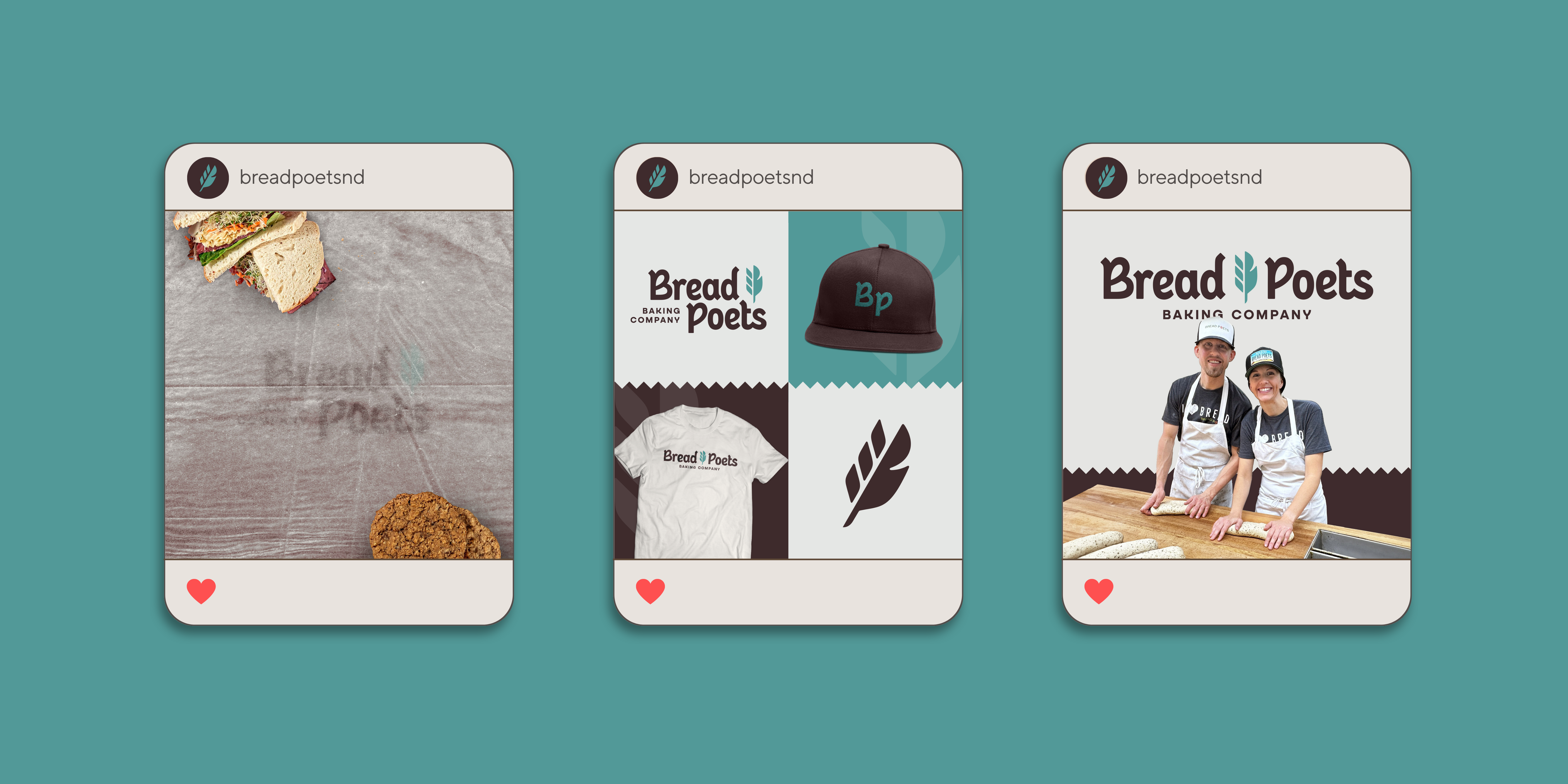
3 If you’re a Bismarck/Mandan resident, you’ve undoubtedly heard of Bread Poets. Afterall, they’re the coolest thing since… Well, sliced bread! This Bismarck bakery has been on the scene since 1998, serving up loaves so fresh that they’ve developed a dedicated following. Their secret? They mill their wheat daily, right there in the shop. Farm to table? More like mill to mouth! In 2022, Peter and Jessica Dargis took the reins. And get this – Jessica’s childhood was basically a Bread Poets commercial. She grew up with the signature baked bread aroma throughout her house. Talk about destiny, right? Image Slide 1 Image Slide 2 Image Slide 3 0F5A8514 After 25 years of success, Bread Poets realized their brand was starting to look a little… stale. They had a loyal fan base that would make any baker blush, but they needed to prove they weren’t just your grandma’s bakery anymore. The mission? Whip up a brand so fresh it would make sourdough starter jealous, all while keeping their OG bread heads happy. Time to roll up our sleeves and get our hands doughy! Here’s how we rose to the challenge. Image Slide 1 Image Slide 2 Image Slide 3 Slide Slide Screenshot 2024-07-31 at 4.14.46 PM Then we moved on to the visuals. It was time to give Bread Poets a glow up. We cooked up a color combo of deep cranberry and teal that’s unique from other local bakeries. The wordmark features a “B” and “P” that subtly convey rising bread. And the new icon? A feather pen that’s a cheeky nod to the “poet” in Bread Poets. Lastly, we created Brand Guidelines to ensure Bread Poets’ new identity would rise. Every detail, from logo use to typography, is spelled out clearly so there’s no guesswork involved! Bread Poets has officially unveiled their new brand to the world! Soon, you’ll see the new branding proudly displayed throughout the bakery, on eye-catching signage, and gracing the shelves of local grocery stores. Whether you’re craving their famous cinnamon logs or in the mood for an artisan sandwich, a visit to Bread Poets now promises both familiar comfort and exciting change. Stop by the shop to witness how this beloved bakery is rising to meet the future while staying true to its roots. After all, some things only get better with time — just like a rising loaf.
Bread Poets
Flavor That Only Poetry Can Express
Introduction
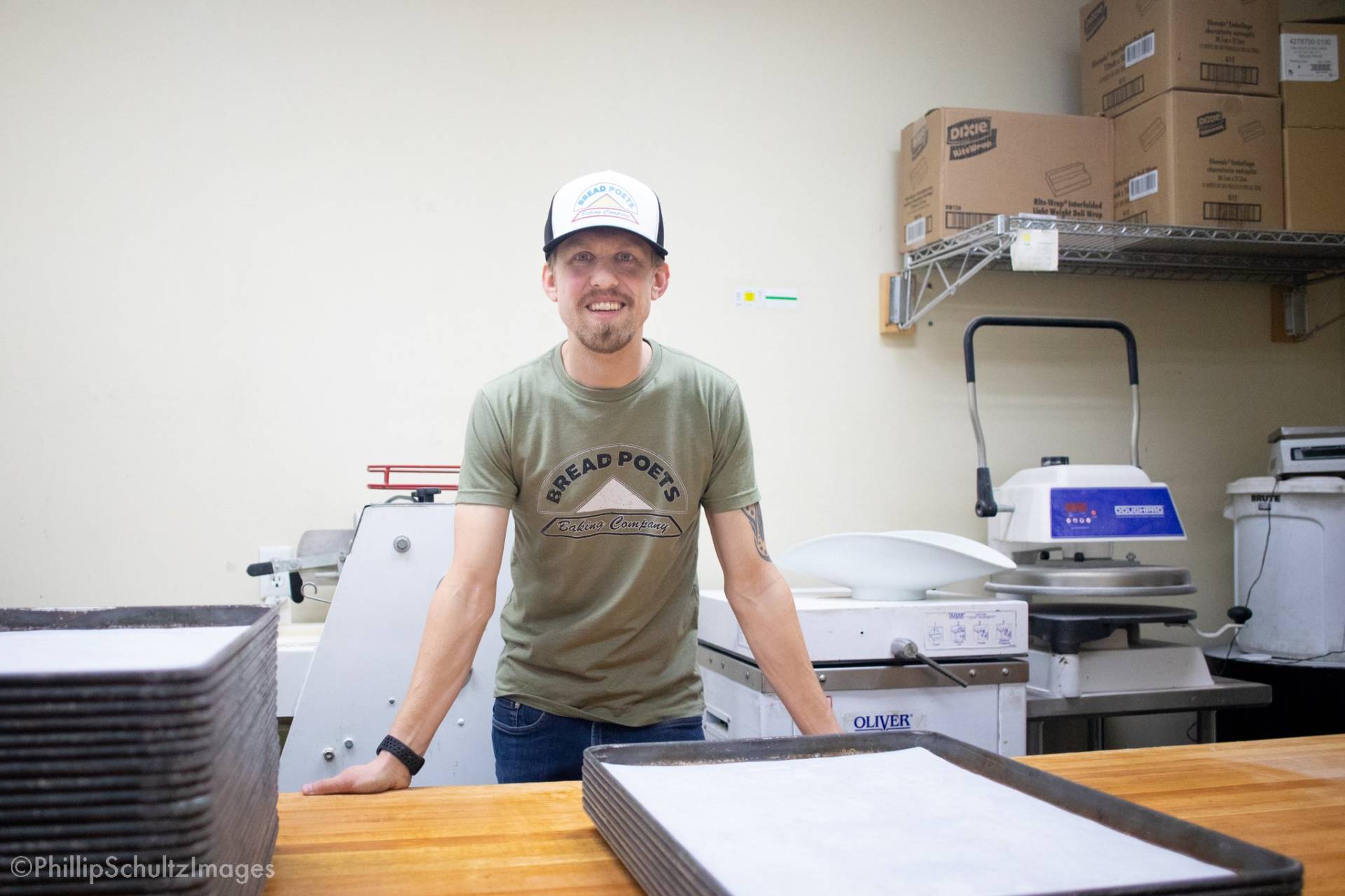
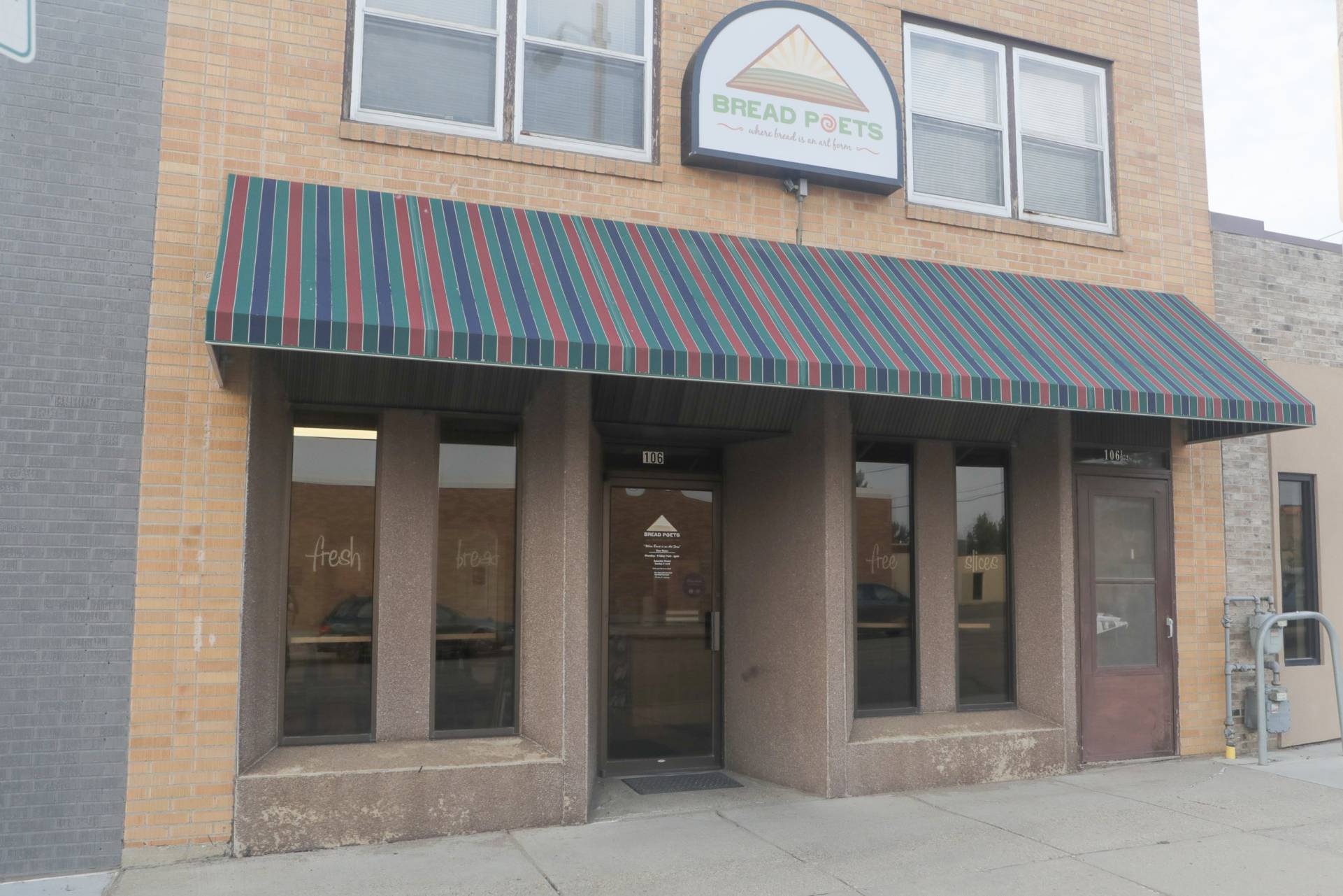
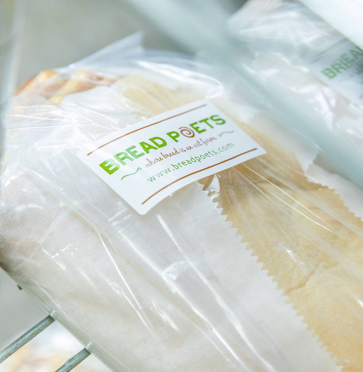
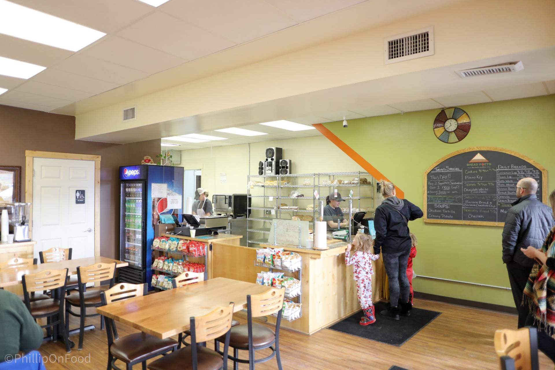
Photo Credit: Phillip Schultz & Bis-Man INC!The Challenge

Start a Project with UsKick your brand up a notch.
The Solutions
Like always, we began with strategy, and dug deep into the soul of Bread Poets. We collaborated on their mission, vision, and values, and determined their core brand attributes: American, Artisan, Premium, Compassionate, and Traditional. We baked this goodness into the rest of their Blueprint, as well as the rest of our branding efforts moving forward.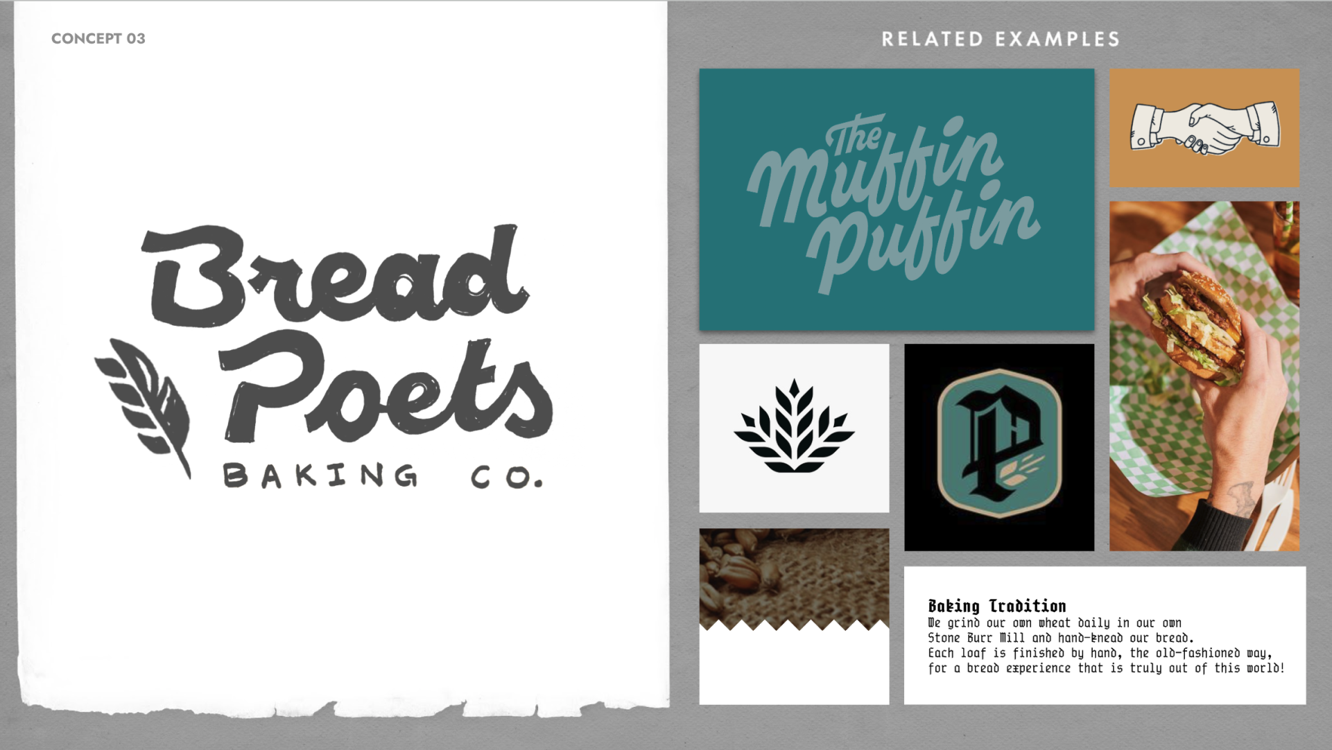

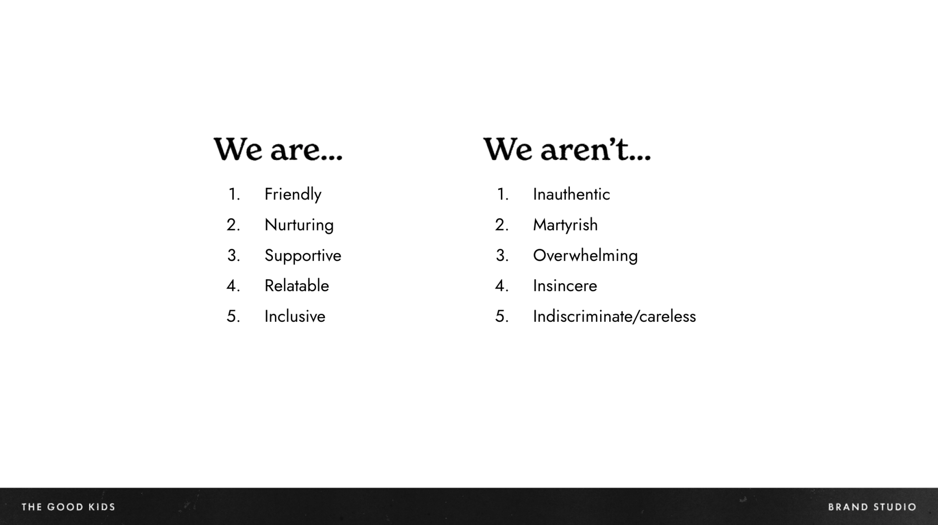
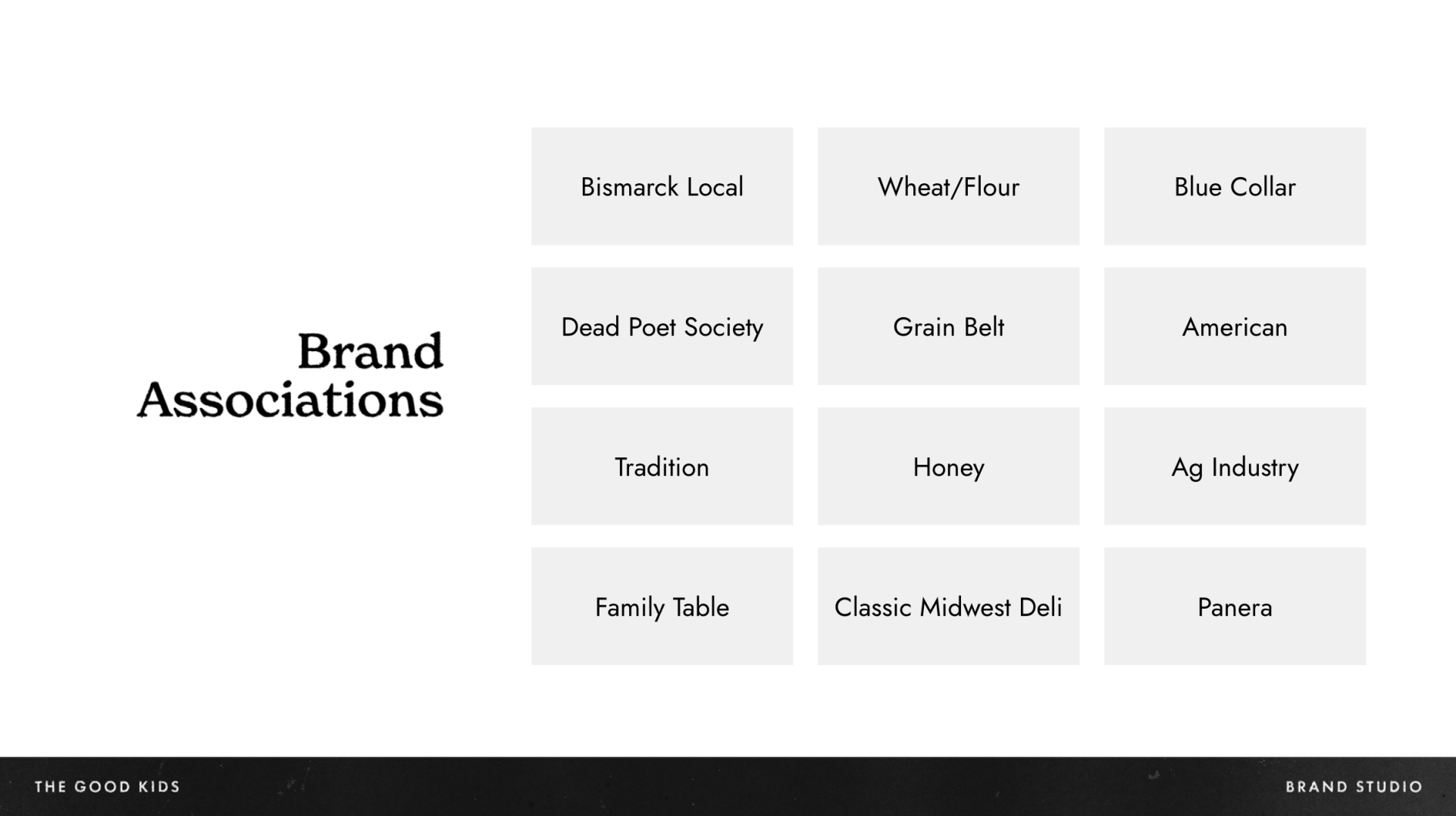
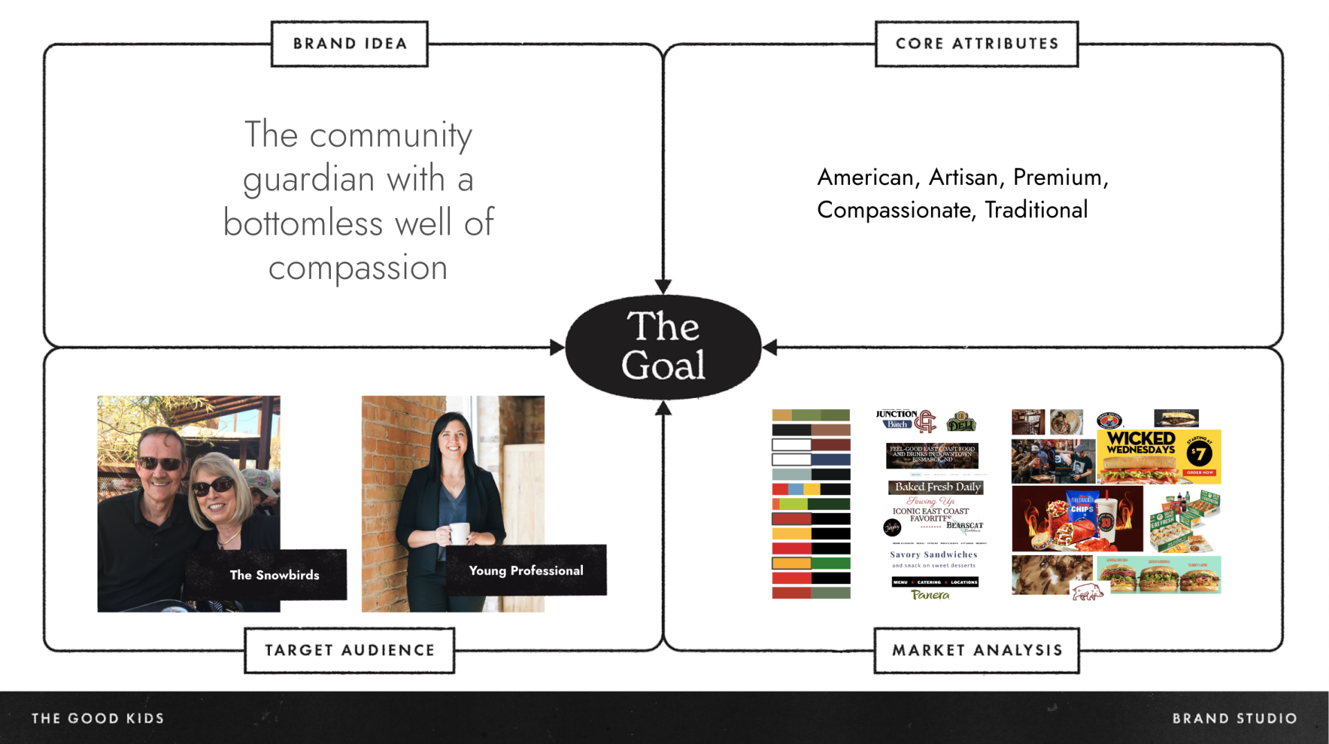
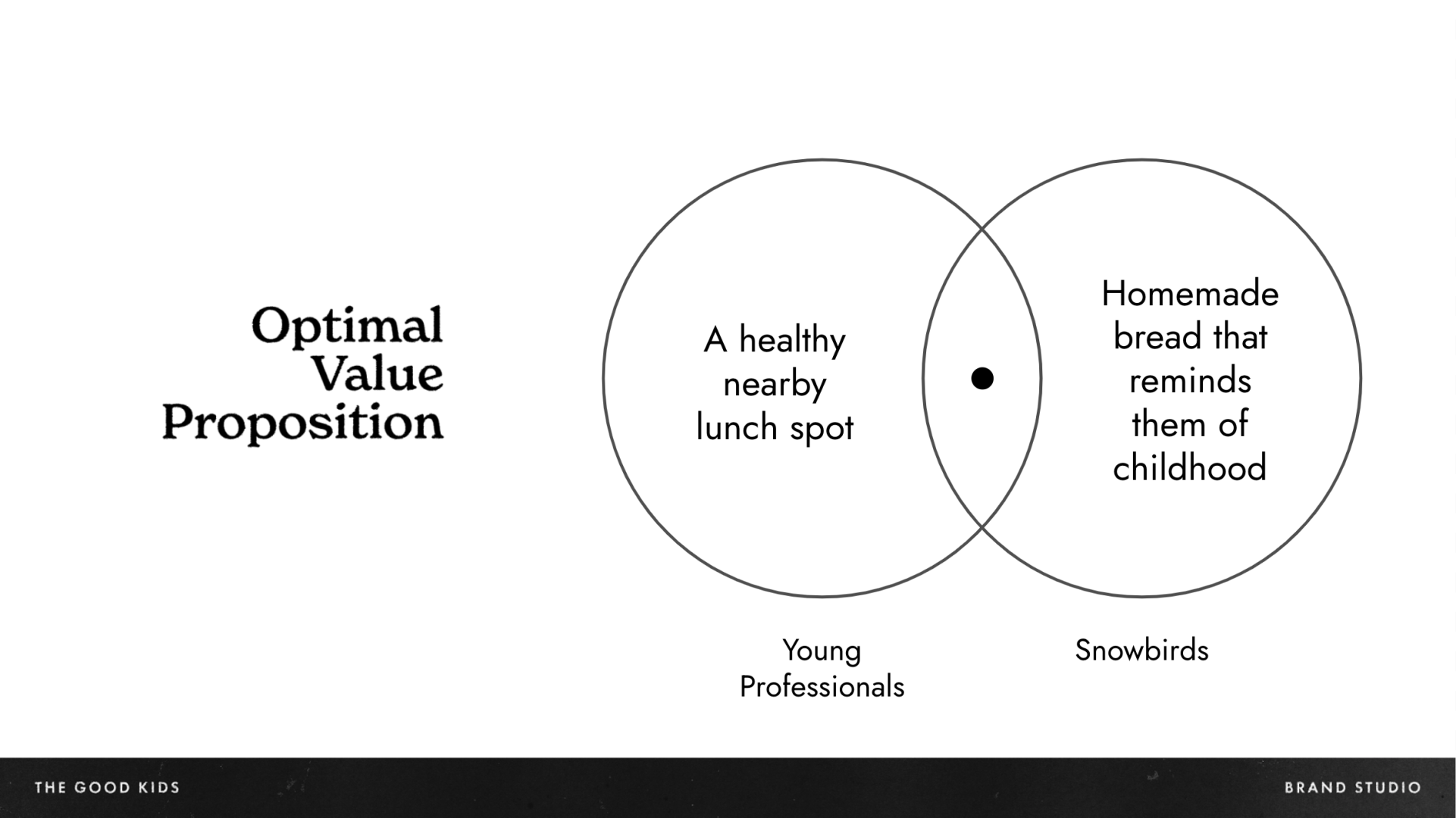
Selected slides from brand blueprint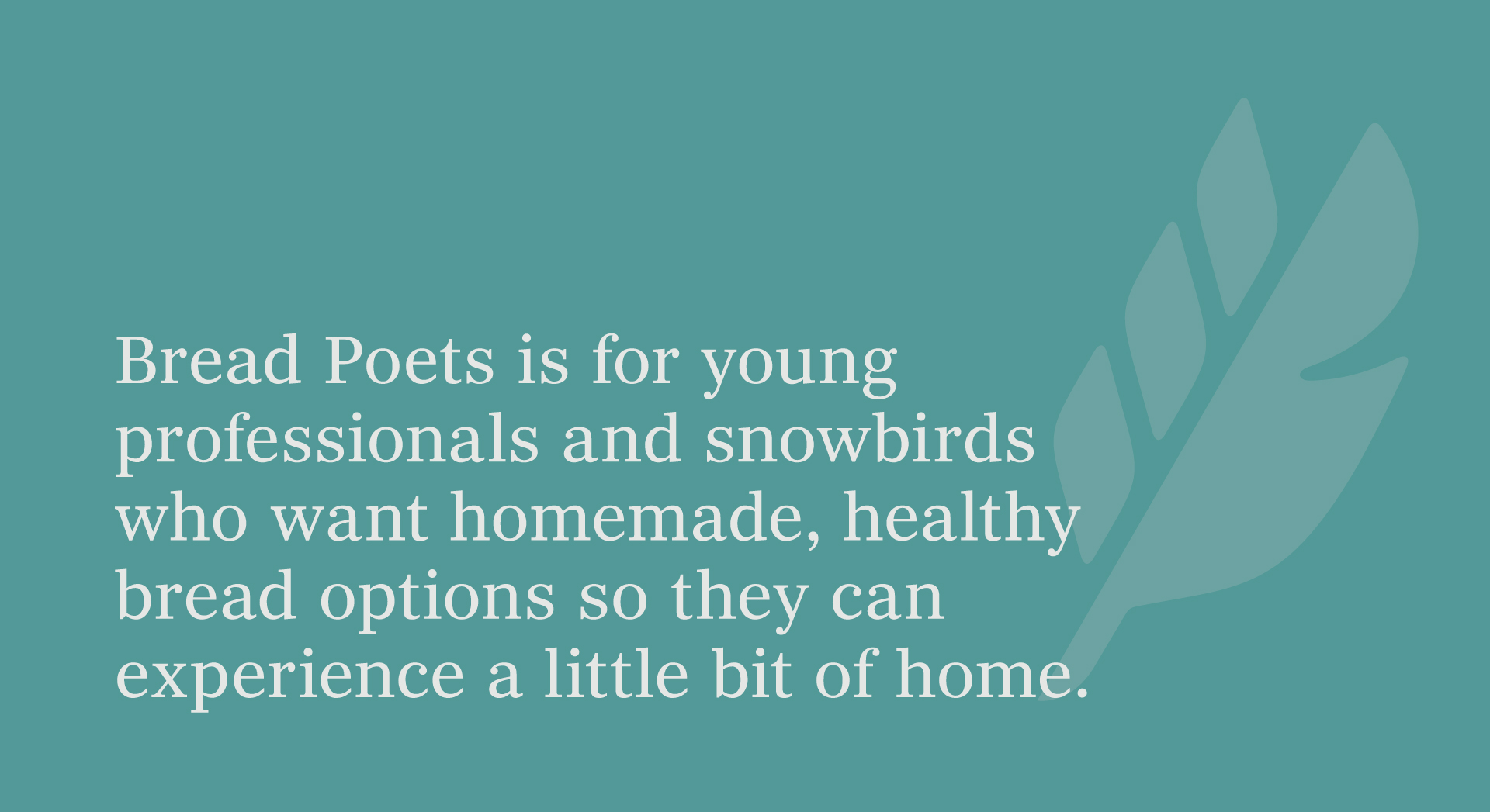
The Results


Start a Project with UsLet’s collaborate on the next big thing together.
We also think you'll like...
ND RISE
The Merc